Unlock the Power of Flexbox and Dominate Web Design

I am Peter, a front-end web developer who writes on current technologies that I'm learning or technologies that I feel the need to simplify.
CSS is the artist of the web world, without it, our lovely internet would be bland and visually unappealing. However, CSS has many tools in its arsenal to achieve its goal of styling. One of these tools is the Flexbox which is a layout module that provides developers with a simple and efficient way to align and distribute elements within a container, thereby making it easier to create flexible and responsive web pages.
Before the advent of Flexbox, we had the following:
Block Display
Inline Display
Table Element.
Position property.
Those methods were not meant for full-scale styling and therefore were a hard way of doing things, with flexbox however came an easier and better way of styling, let’s have a look at all CSS Flexbox has to offer.
Flexbox Container
First things first, you need to first define a flex container. Like this example 👇
<div class="container">
</div>
then, you set the display of the container to flex
.container{
  display: flex;
}
Now, this unlocks a bunch of properties for the flex container which are:
flex-direction
flex-wrap
flex-flow
justify-content
align-items
align-content
The flex-direction Property
The flex-direction property defines what direction the container is to stack the flex items, it has these 4 values : row (default), column, row-reverse and column-reverse.
Example:
.container{
  display: flex;
  flex-direction: column;
}
The flex-wrap Property
The flex-wrap property is used to specify whether the flex items should wrap or not, its two values are wrap and nowrap. Example:
.container{
  display: flex;
  flex-direction: column;
  flex-wrap:  nowrap;
}
The flex-flow Property
The flex-flow property is a shorthand property used to set both the flex-direction and flex-wrap properties in one line.
Example:
.flex-container {
  display: flex;
  flex-flow: column-reverse wrap;
}
The Justify Content Property
The justify-content property aligns the flex container’s items when the items do not use all available space on the main axis (i.e when the flex-direction is set to row, justify-content works horizontally, when it’s set to column, justify-content works vertically). Its values are:
flex-start(default) — Items are positioned at the beginning of the containerflex-end— Items are positioned at the end of the containercenter— Items are positioned at the center of the containerspace-between— Items are positioned with space between the linesspace-around— Items are positioned with space before, between, and after the lines
The align-items Property
The align-items property is also used to align the flex items, it determines how flex items are aligned within a baseline and along the cross-axis.
The values for align-items are:
stretch— stretches the items to fit the container.center— positions the items at the center of the container.flex-start— positions the items at the beginning of the container.flex-end— positions the items at the end of the container.baseline— positions the items at the baseline of the container.
Example of the align-items property in use:
<div class="flex-container">
  <div class="flex-item">1</div>
  <div class="flex-item">2</div>
  <div class="flex-item">3</div>
  <div class="flex-item">4</div>
  <div class="flex-item">5</div>
  <div class="flex-item">6</div>
</div>
.flex-container{
  display: flex;
  flex-wrap: wrap;
  justify-content: center;
  background-color: #FFA100;
  align-items: center;
  height: 300px;
}
.flex-item:nth-child(even){
  background-color: blue;
  padding: 50px;
  height: 50px;
  color: white;
}
.flex-item:nth-child(odd){
  background-color: white;
  height: 80px;
  padding: 50px;
  color: black;
}

The Align Content Property
The align-content property is similar to align-items, but instead, it aligns flex items just along the cross-axis, it aligns the flex-lines (sides) of the items.
The flex line is a line that follows the direction of the text which, in a left-to-right mode, is left to right. However, if you were to change the text direction using the flex-direction property, the direction of the flex line will also change.
The values for align-content are:
center— positions the items at the center of the container.start— positions the items at the beginning of the container.end— positions the items at the end of the container.flex-start— positions the items at the beginning of the container.flex-end— positions the items at the end of the container.space-between— distribute items with space between them.space-around— distribute items evenly with equal space around them.space-evenly— distribute items evenly with equal space.stretch— stretches ‘auto’-sized items to fit the container.
Example of the align-content property in use:
<div class="flex-container">
  <div class="flex-item">1</div>
  <div class="flex-item">2</div>
  <div class="flex-item">3</div>
  <div class="flex-item">4</div>
  <div class="flex-item">5</div>
  <div class="flex-item">6</div>
</div>
.flex-container{
  display: flex;
  flex-wrap: wrap;
  justify-content: center;
  background-color: #FFA100;
  align-content: center;
  height: 300px;
}
.flex-item:nth-child(even){
  background-color: blue;
  padding: 50px;
  height: 50px;
  color: white;
}
.flex-item:nth-child(odd){
  background-color: white;
  height: 80px;
  padding: 50px;
  color: black;
}

Flexbox Items
So, we’ve treated the flex container properties, now let’s look at the flex items properties 👇
flex-grow
flex-shrink
flex-basis
flex
order
align-self
The flex-grow Property
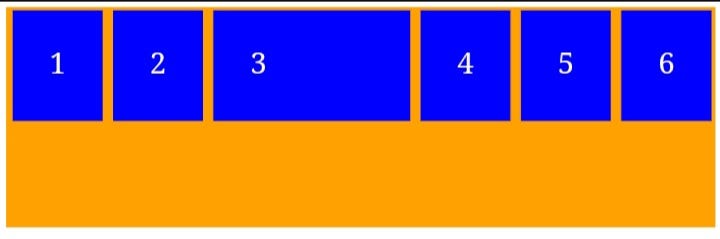
The flex-grow property specifies how much a flex item will grow relative to the rest of the flex items. i.e if you set an item to a flex-grow of X , it will grow X times as other flex-items. The value must be a number, default value is 0.
Here is an example showing the 3rd Div with a flex-grow property of 2, which means
<div class="flex-container">
  <div class="flex-item" >1</div>
  <div class="flex-item" >2</div>
  <div class="flex-item" id="select-item" >3</div>
  <div class="flex-item" >4</div>
  <div class="flex-item" >5</div>
  <div class="flex-item" >6</div>
</div>
.flex-container{
  display: flex;
  flex-wrap: nowrap;
  justify-content: center;
  background-color: #FFA100;
  align-content: center;
  height: 300px;
}
.flex-item{
  background-color: blue;
  padding: 70px;
  height: 50px;
  color: white;
  margin: 5px;
  font-size: 40px;
}
#select-item{
  flex-grow: 2;
}
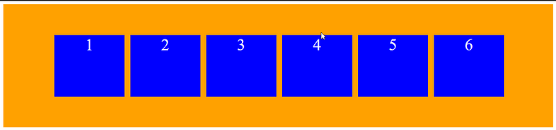
The flex-shrink Property
The flex-shrink property specifies how much a flex item will shrink relative to the rest of the flex items. The value must be a number, default value is 1.
Here’s an example of the flex-shrink property in action:
<div class="flex-container">
  <div class="flex-item" >1</div>
  <div class="flex-item" >2</div>
  <div class="flex-item" id="select-item" >3</div>
  <div class="flex-item" >4</div>
  <div class="flex-item" >5</div>
  <div class="flex-item" >6</div>
</div>
.flex-container{
  display: flex;
  flex-wrap: nowrap;
  justify-content: center;
  background-color: #FFA100;
  align-items: center;
  height: 300px;
}
.flex-item{
  background-color: blue;
  text-align: center;
  width: 170px;
  height: 150px;
  color: white;
  margin: 5px;
  font-size: 40px;
  flex-shrink: 1;
}
#select-item{
  flex-shrink: 4;
}
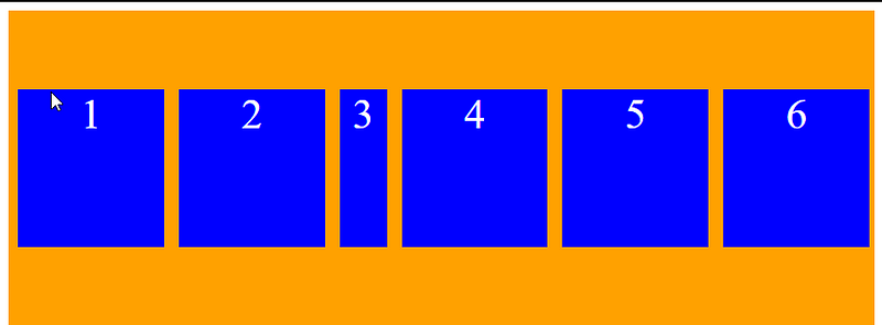
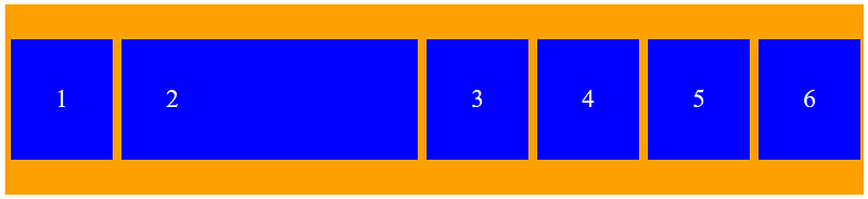
The flex-basis Property
The flex-basis property is used to specify the initial length of a flex item.
Here’s an example of the flex-basis property in use:
<div class="flex-container">
  <div class="flex-item" >1</div>
  <div class="flex-item" id="select-item">2</div>
  <div class="flex-item" >3</div>
  <div class="flex-item" >4</div>
  <div class="flex-item" >5</div>
  <div class="flex-item" >6</div>
</div>
#select-item{
  flex-basis: 200px;
}
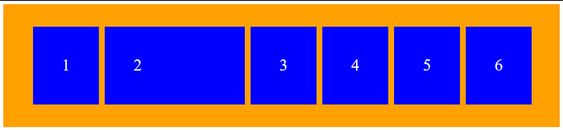
The flex Property
The flex property is a shorthand property for the flex-grow, flex-shrink, and flex-basis properties.
Here’s an example making the 2nd flex item grow twice as fast [ flex-grow: 2;], not shrinkable [ flex-shrink: 0; ], and with an initial length of 200 pixels [ flex-basis: 200px ]:
<div class="flex-container">
  <div class="flex-item" >1</div>
  <div class="flex-item" id="select-item">2</div>
  <div class="flex-item" >3</div>
  <div class="flex-item" >4</div>
  <div class="flex-item" >5</div>
  <div class="flex-item" >6</div>
</div>
#select-item{
  flex:2 0 200px;
}
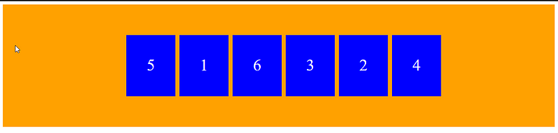
The order Property
The order property specifies the order of the flex items, with this, the first flex item you wrote in the code doesn’t have to be rendered as the first item. The order value is a number, and the default value is 0.
Use the order property to change the order of the flex items:
<div class="flex-container">
  <div class="flex-item" style="order: 2">1</div>
  <div class="flex-item" style="order: 5">2</div>
  <div class="flex-item" style="order: 4">3</div>
  <div class="flex-item" style="order: 6">4</div>
  <div class="flex-item" style="order: 1">5</div>
  <div class="flex-item" style="order: 3">6</div>
</div>
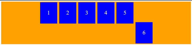
The Align Self Property
The align-self property specifies the alignment for the selected item inside the flexible container.
The values for align-self are:
center— positions the selected item at the center of the container.flex-start— positions the selected item at the beginning of the container.flex-end— positions the selected item at the end of the container.stretch— positions the selected item to fit the container.baseline— positions the selected item at the baseline of the container.
<div class="flex-container">
  <div class="flex-item" >1</div>
  <div class="flex-item" >2</div>
  <div class="flex-item" >3</div>
  <div class="flex-item" >4</div>
  <div class="flex-item" >5</div>
  <div class="flex-item" id="select-item" >6</div>
</div>
#select-item{
  align-self: flex-end;
}
Conclusion
As you have seen, the CSS flexbox gives rise to a whole new wave of styling and positioning ability that is sure to take your CSS skills to the next level, and here’s a final tip 💡, to position an element in your flex container in the exact center both vertically and horizontally just set both the justify-content property and the align-items property to center .
If you enjoyed this and found it useful, do well to follow me on Medium, Twitter, WhatsApp, and Hashnode, I’ll love to see what wonderful things you create with this newly gained knowledge.


